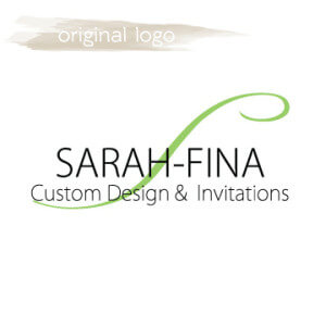
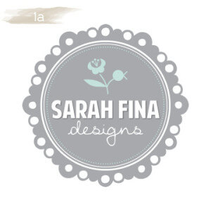
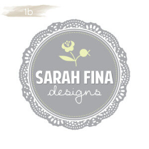
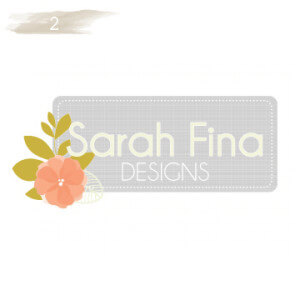
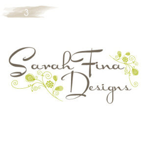
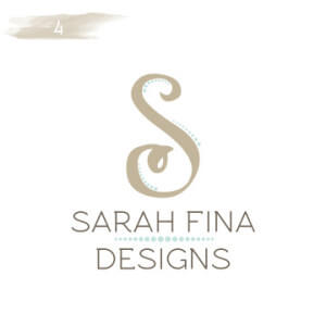
It has been almost three years since I started Sarah-Fina Custom Designs & Invitations. Over the years I have had many opportunities to help others with design and custom invitations from logos to weddings, baby showers and beyond. My skills as a designer have evolved and grown and I have finally been able to focus a little on my own materials. With this logo redesign, I hope to create a soft, inviting, fun, and pleasing logo for my work. It’s time my logo more accurately reflects the design aesthetics of my more current work. Of course when it comes to other designs I have quick opinions and preferences but when it comes to my own stuff, I am quite indecisive. So, I ask you, my friends, family, clients, and others to help me narrow down the direction for my logo. I am sharing with you 5 rough draft design directions that I would love if you could provide feedback for. Which do you like, how are the colors, if you were a potential client would you be drawn to one over another? Any feedback is appreciated. Some designers might frown upon asking clients and others for feedback on your logo, but I am deciding to beat to my own drum. I wasn’t formally trained in design and much of what I have learned is self taught. I figure my approach has worked for me so far and I am going to trust my own strategies! Thanks for your support and positive feedback over the years. After this logo redesign, I have goals to update my blog, web site, and share more recent photos of my latest projects (I am about a year and a half behind on current photos).
Thank you!!!
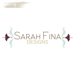
4 or 5 gets my vote, gotta kern that “Fi” on 5. Nice color palettes.
I like 3 and 4
Thanks Phil and Hilary. The turquoise blue looks a lot more bright than I originally intended it to be, I might need to adjust that a little more.